Infographics: The Visual Revolution in Social Media
Az infografika segít a bonyolult adatok érthető átadásában. Növelje elérését vizuális tartalommal! Olvassa el tippjeinket a media.isi.studio oldalon!
Attention is the new currency, but are we just throwing spare change?
Let’s be honest: when was the last time you read a 2,000-word technical article in its entirety while scrolling on your phone during a commute? Probably never. The human brain processes images 60,000 times faster than plain text, yet many still try to capture attention with massive blocks of text. In the world of social media, that’s like trying to whisper with a megaphone at a rock concert.
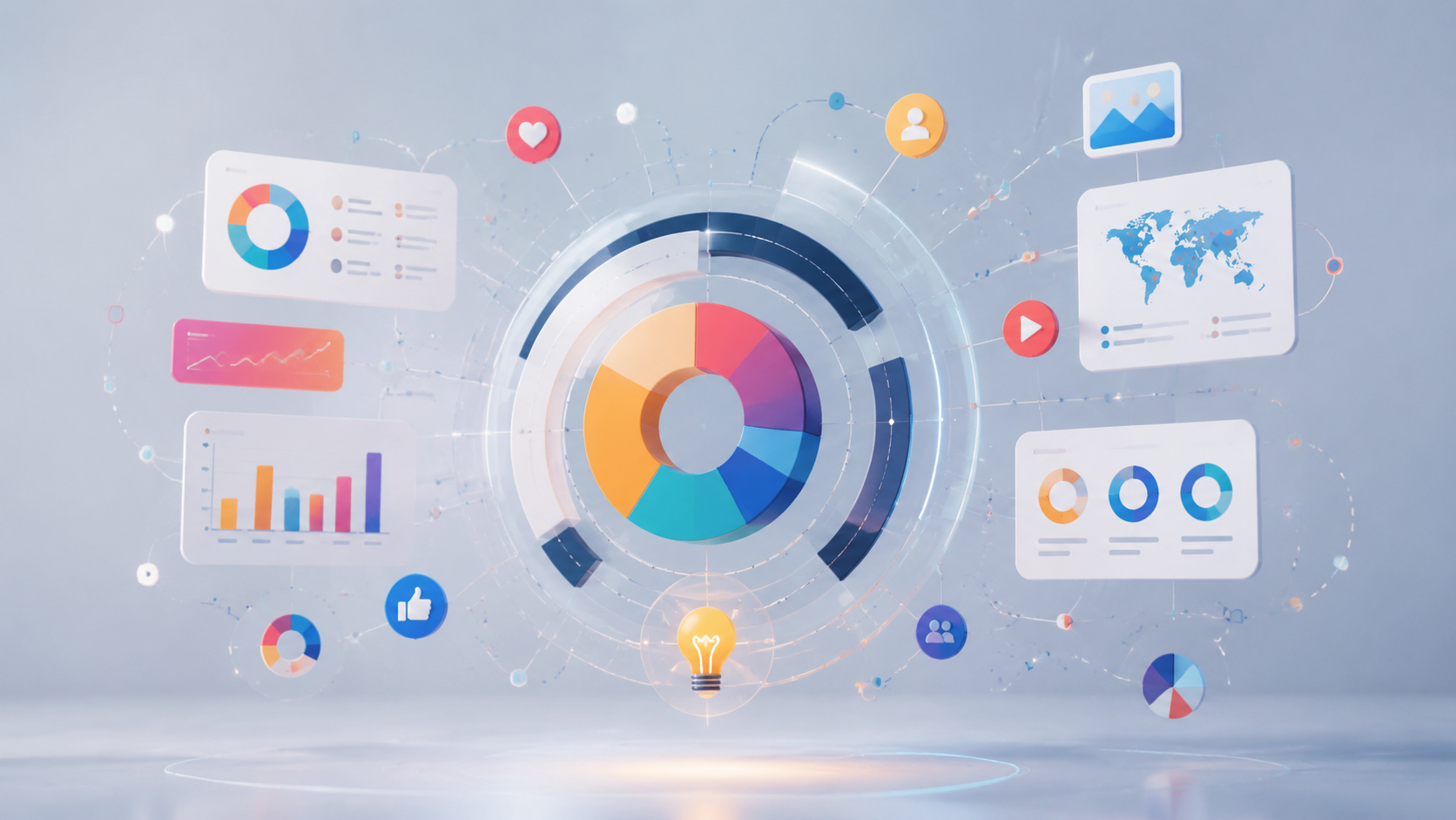
The greatest paradox of modern content creation is that while more information is available than ever before, it has never been harder to actually communicate it. This is where infographic-based posts come in. These aren't just decorative elements; they are the Swiss Army knives of knowledge sharing. They condense, explain, entertain, and—most importantly—stick in the memory. But why have marketers and educators suddenly become obsessed with these colorful charts? The answer lies in cognitive psychology and the radical shift in user habits.
The cognitive shortcut: Why our brains crave visuals
Our brains are fundamentally efficient—some might even say lazy. This isn't a critique; it's a biological fact. Reducing Cognitive Load—the mental effort required to process information—is the fastest way to a user’s heart. When we see a well-structured infographic, the brain breathes a sigh of relief. It doesn't have to navigate linearly from left to right, line by line. It immediately grasps relationships, hierarchy, and the core message.
Think about it: a complex market analysis or a biological process described over several pages is tedious. The same data illustrated with a pie chart, a few icons, and arrows? Instant recognition. This "Eureka moment" is why people don't just view these posts—they save them. Social media algorithms love saves. A save is worth ten likes because it signals to the system that the content provides real value that the user wants to return to later.
The psychology of saveability and shareability
There is something deeply human about collecting knowledge. We used to buy encyclopedias; today, we fill our Instagram "Saved" folders with infographics. But why are we more likely to share an infographic than a standard article? The answer lies in self-expression. When I share a smart infographic, I’m telling the world: "Look, I care about these important and useful things." This is one of the purest forms of Ego-marketing.
Visual content creation is no longer the exclusive privilege of professional graphic designers. Platforms like media.isi.studio allow anyone to create a stunning visual world using AI-powered tools. The democratization of technology means the competition is no longer about software skills, but about the clarity of the message. If you have a great idea but can't visualize it, it's like having the philosopher's stone but keeping it hidden in a dark room.
The age of snackable content
In social media today, Snackable Content—short, easily digestible bits of information—reigns supreme. An infographic is the perfect "bite." It doesn't ask the user to sacrifice 10 minutes of their life. It asks for 30 seconds and gives a concrete takeaway in return. This is a fair trade in the digital noise.
- Speed: The core message is delivered in seconds.
- Structure: It guides the eye and prevents attention from drifting.
- Credibility: Visualizing data conveys professionalism and authority.
When AI and graphics collide
I’m often asked: "But what if I can’t draw?" My answer is simple: don't even try. The future of content strategy lies in hybrid solutions. We can leave data analysis and outlining to automated systems and use cutting-edge technology to generate visual elements. For example, with the AI video and imaging tools available at media.isi.studio, we can insert dynamic elements into static infographics that literally pop off the screen.
Imagine a static infographic where a small, AI-generated animation explains the most complex point in the center. This kind of Interactive Infographic—visual data storytelling that a user can engage with—is the next big thing. We don't just look at the content; we experience it. The technology is already here; we just need to start using it.
Anatomy of the perfect infographic: More than just colorful dots
Many make the mistake of stuffing an infographic with so much data that it becomes unreadable chaos. Here, less really is more. A good infographic has a central narrative. Yes, even data needs a story!
- The Hook: A provocative title or a shocking stat that stops the scroll.
- Hierarchy: What is most important? Make it the largest element. Don't force the reader to solve a puzzle.
- Color Coding: Colors aren't just for decoration. Red warns, green soothes, and contrast highlights.
- The CTA (Call to Action): What should the user do after gaining this insight? Save it? Share it? Click the link?
Remember that social media platforms require different aspect ratios. What looks great on a Pinterest board might be unreadable in an Instagram Carousel format. Today's content marketers must be "fluent" in these visual dialects.
Common mistakes that kill conversion
I’ve seen infographics so over-designed that the creator forgot to include the actual point. Style over substance is the death of content. If a user doesn't understand what's going on within 3 seconds, you've failed.
The other extreme is the boring Excel sheet slapped onto a colored background. That isn't an infographic; it's visual pollution. People don't want raw data; they want context. Tell them what those numbers mean in their daily lives! If you run a non-profit, don't just post "We raised $5,000." Show an infographic of how many meals, how many rescued animals, or how many trees that represents.
The future of knowledge sharing: Visual injections
For educators and institutions, infographics are no longer optional—they are essential. Gen Z and those following have been socialized in a world where information is visual and instantaneous. If a university or a course still relies solely on 50-page PDFs, it will lose its students.
Infographics enable Micro-learning—breaking down knowledge into small, targeted units. A complex historical timeline or a physics formula derivation is much more effective when broken into visual milestones. This is the future: knowledge isn't a heavy book; it's a sharable digital card.
Final thoughts: How to get started
You don't need to start with the most complex diagrams. Start small: take a successful blog post and extract 3 key statistics. Create a simple visual outline. Use the media.isi.studio platform to bring a professional visual aesthetic to your message. The key is consistency.
An infographic isn't a one-time trend; it's a strategic investment. It’s content that can drive reach months later because its value doesn't expire as quickly as a daily news update or a meme. Start thinking visually, and watch as your audience finally stops scrolling and actually understands what you have to say.
Glossary
- ROI (Return on Investment)
- A performance measure used to evaluate the efficiency or profitability of an investment relative to its cost.
- Cognitive Load
- The amount of mental effort and brain capacity used in the working memory to process and understand information.
- Snackable Content
- Short, high-value content designed for quick and easy consumption during social media browsing.
- CTA (Call to Action)
- A prompt—either text or visual—designed to encourage the user to take a specific action (e.g., click, buy, subscribe).
- Micro-learning
- An educational approach that delivers content in small, highly focused, and easily digestible chunks.
- Interactive Infographic
- A visual data representation that allows users to interact with elements, such as clicking for more info or triggering animations.